DOUBLE THE PELL
40 years ago, the Federal Pell Grant covered more than 75 percent of a student’s 4-year college costs. Over time, disinvestment has eroded the value of the grant to nearly a quarter of a 4-year college costs.
OVERVIEW
Double the Pell was a hashtag and campaign before it came across my desk. There were lots of existing visual treatments and messaging — I was tasked with creating something that could rally various universities and voices around the the same visual concept.
ROLE
Lead Designer
Art Director
SCOPE
Branding
Logo
Web Design Marketing Materials
TEAM
Matt Glass
Sarah Oldenburg
THE MARK
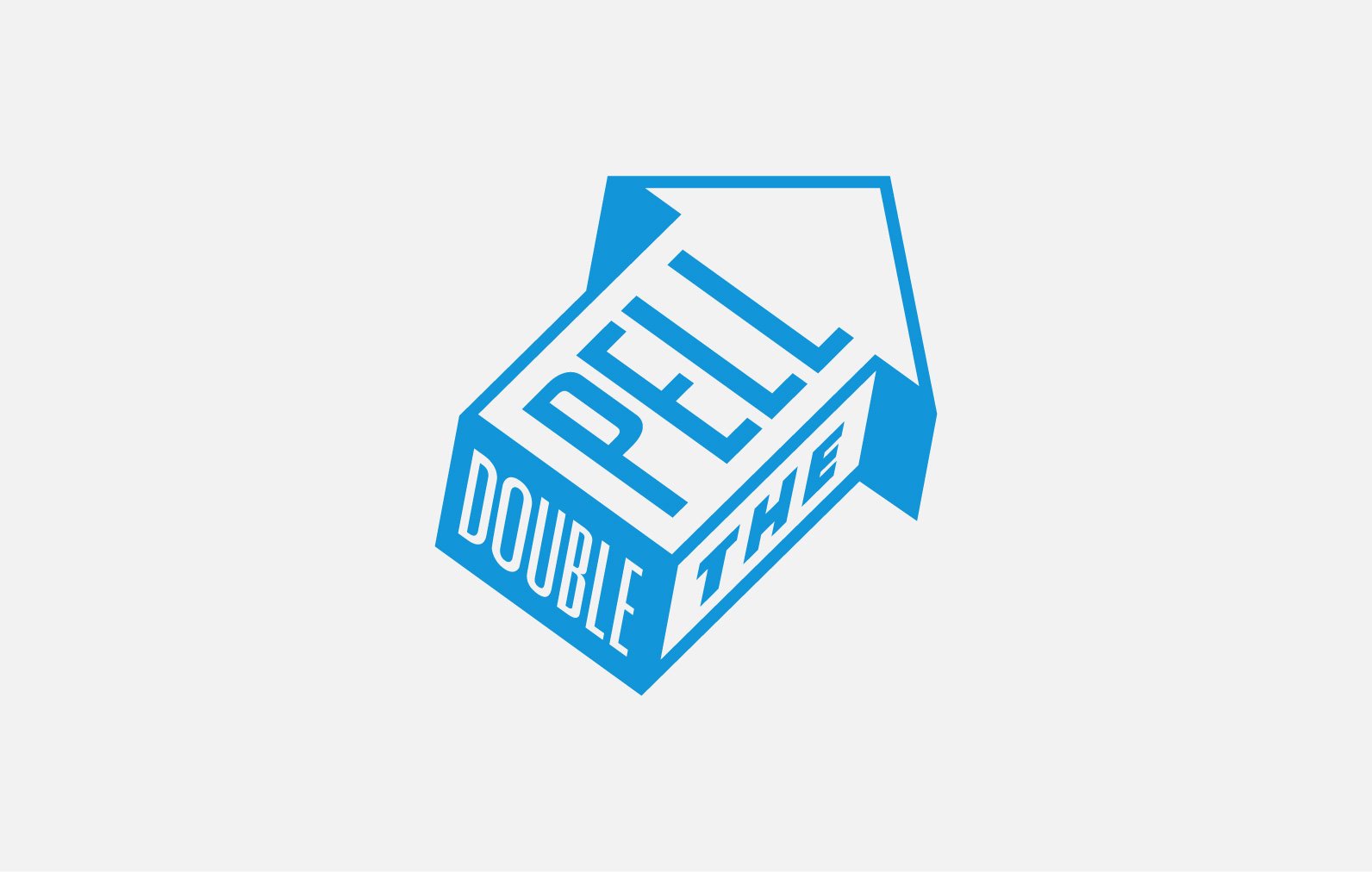
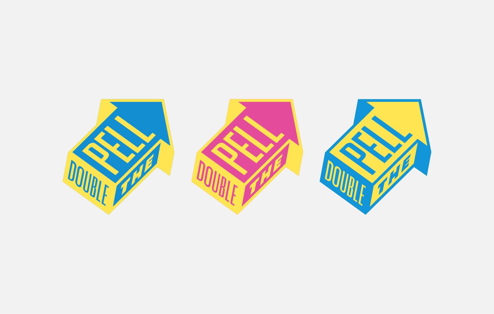
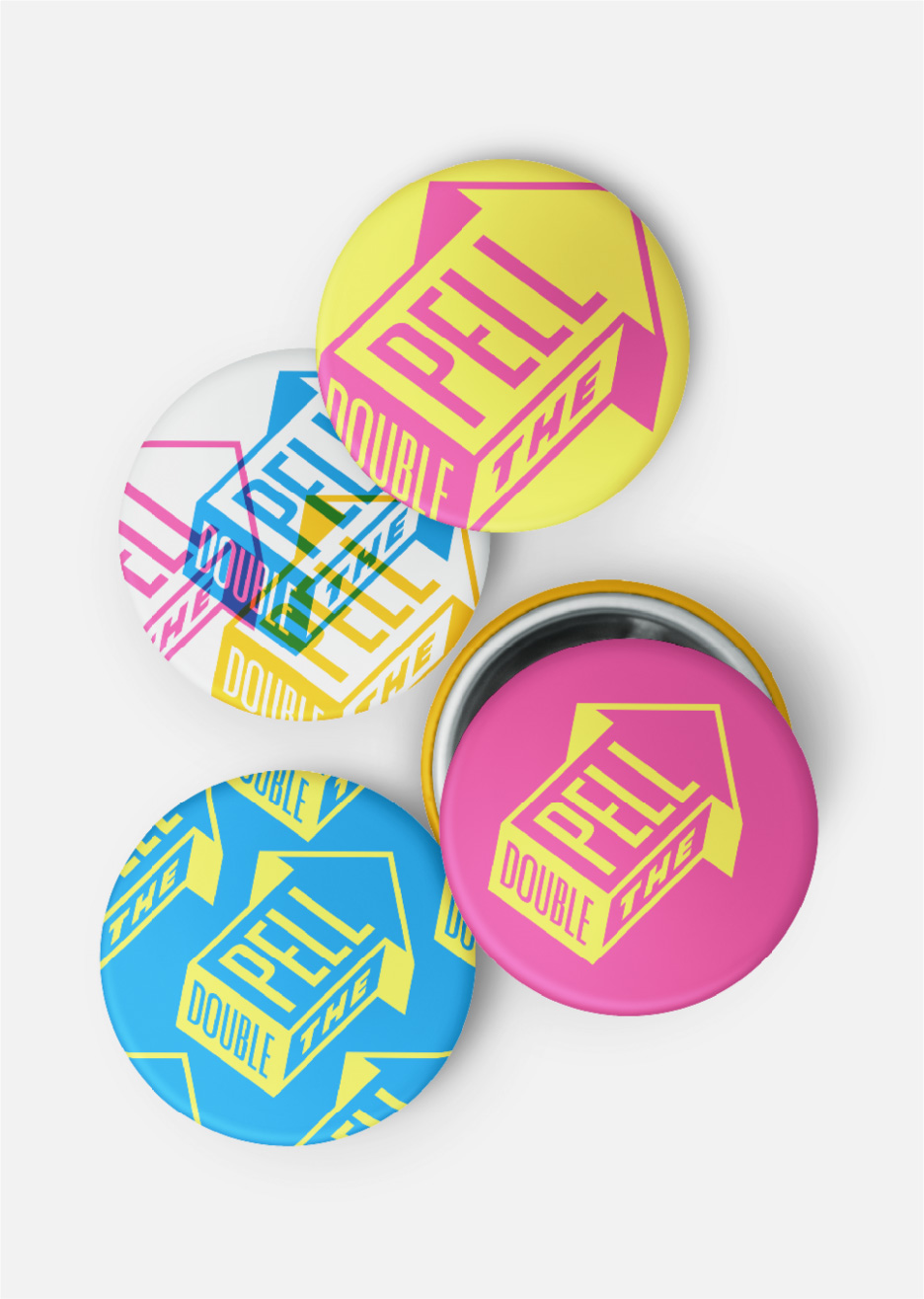
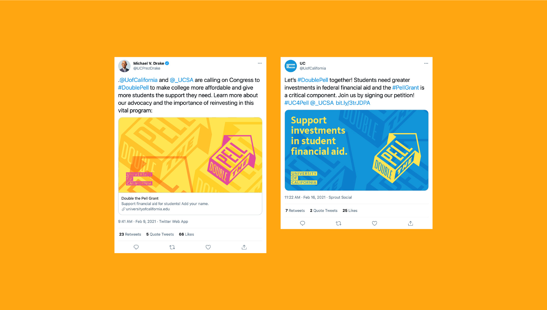
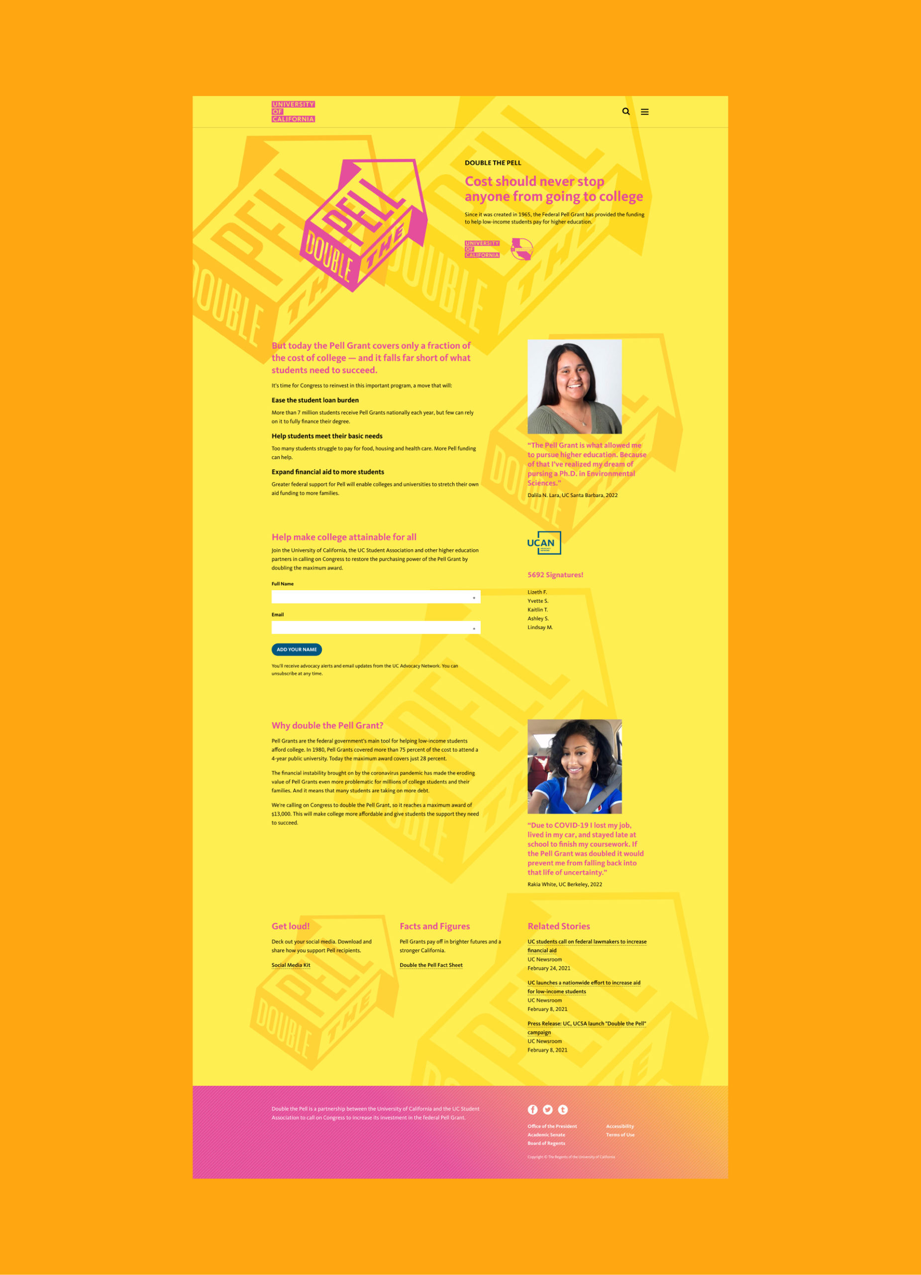
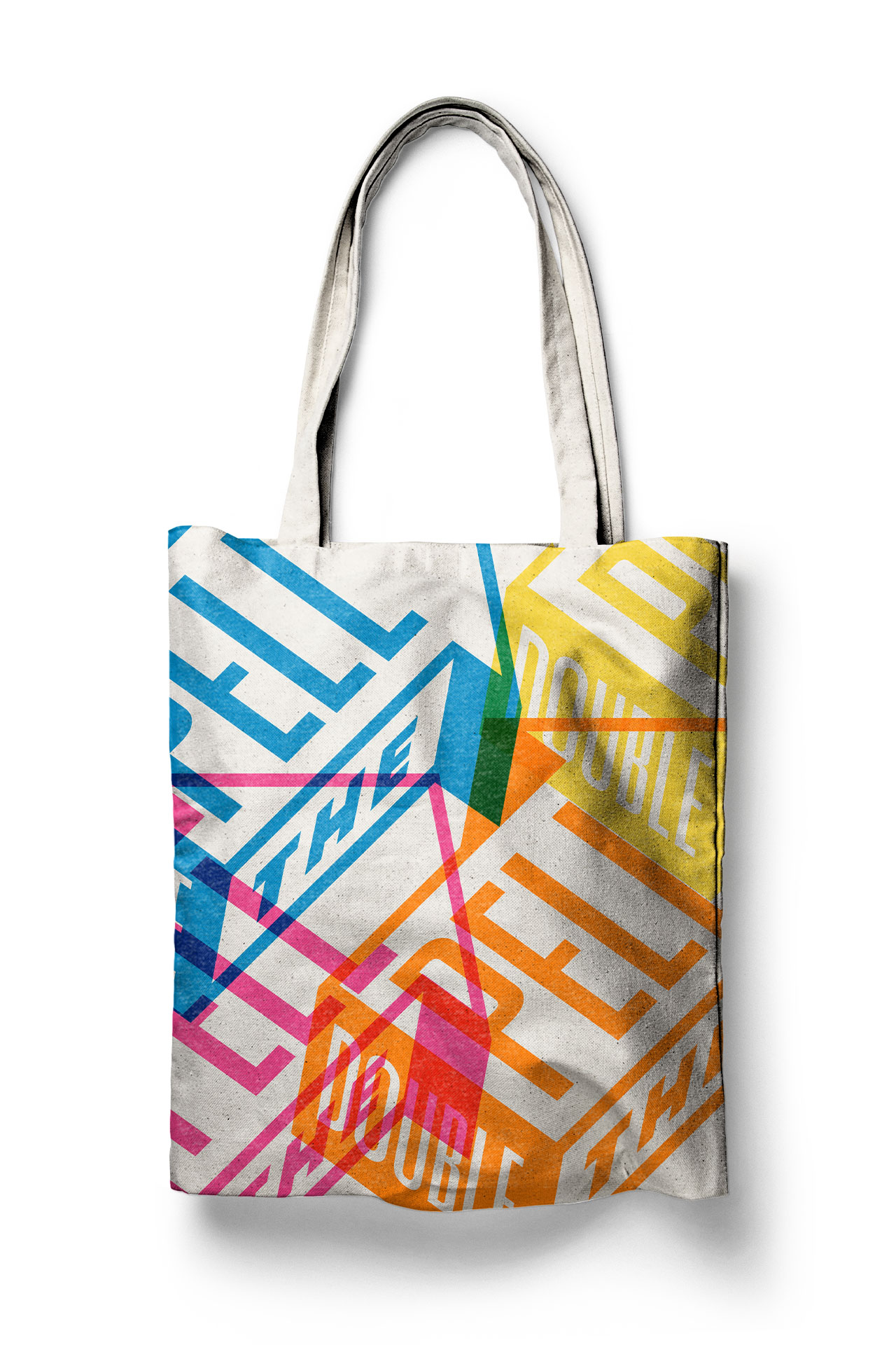
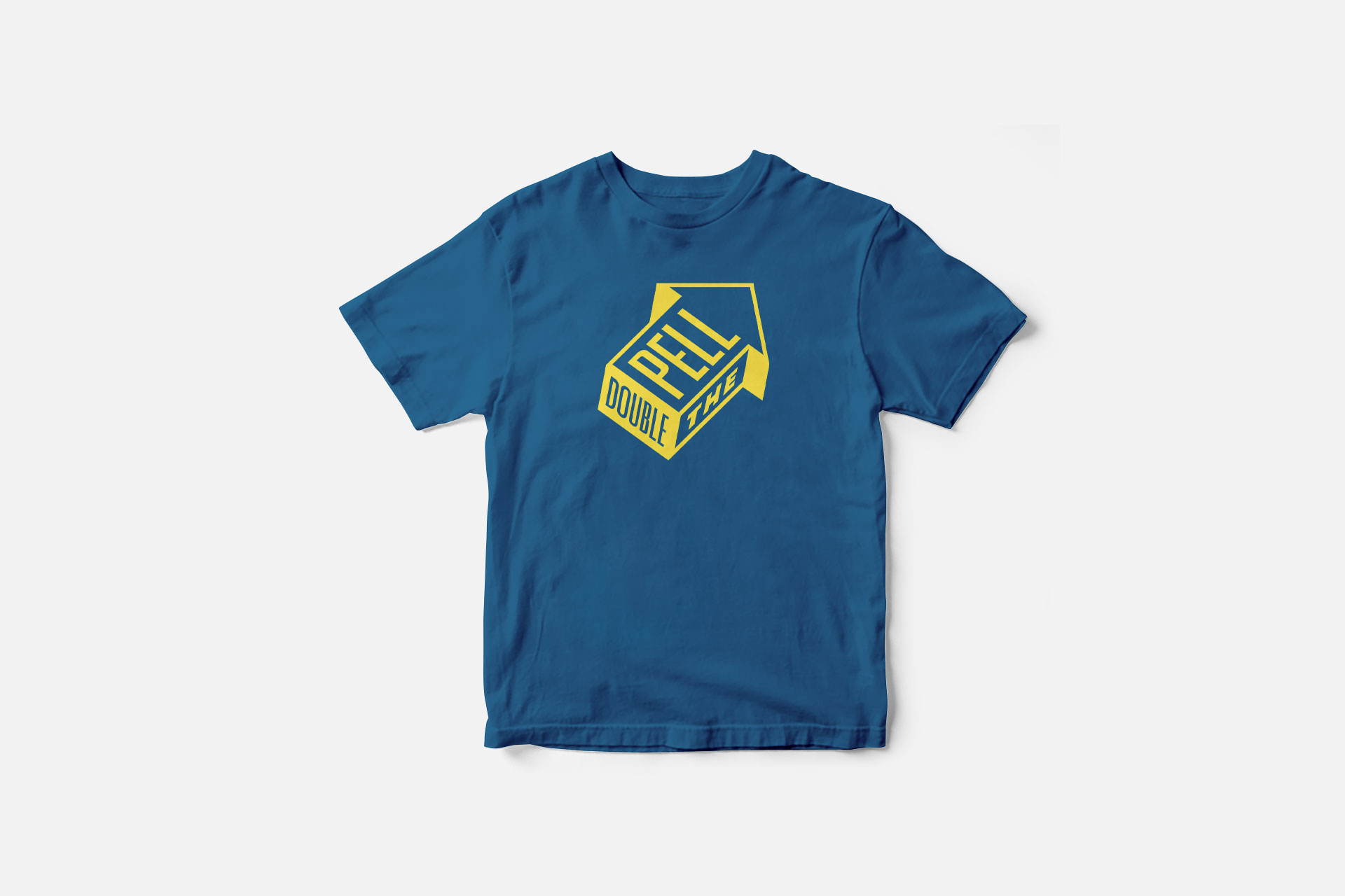
This campaign centers around an optimistically upward-facing arrow. Double the Pell fits snugly into the three visible sides and can be used equally as a small bug in the corner of a photo, or it can be loud and front and center with plenty of bold color and texture. One of the goals was to create a flexible system that could accomodate a number of needs and uses from a large and diverse community.
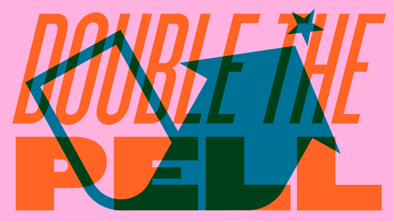
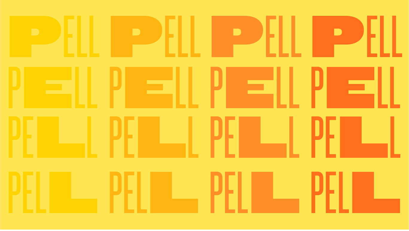
Alternate concepts