Treasury Prime
Treasury Prime is an embedded banking platform connecting banks and fintechs via API, supporting payments, account opening, and card issuance, ensuring security, compliance, and rapid deployment.
OVERVIEW
As Treasury Prime's first brand designer I was tasked with pushing our existing brand and helping to define our web presence, graphic styles, interfaces and visual language. I hired for and led a small creative team where we pushed the brand into a more artistic and relateable territory.
ROLE
Lead Designer
Creative Director
SCOPE
Brand
Logo
Identity
Book/Publication
TEAM
Myles Ketelsen
David Thompson-Brussar
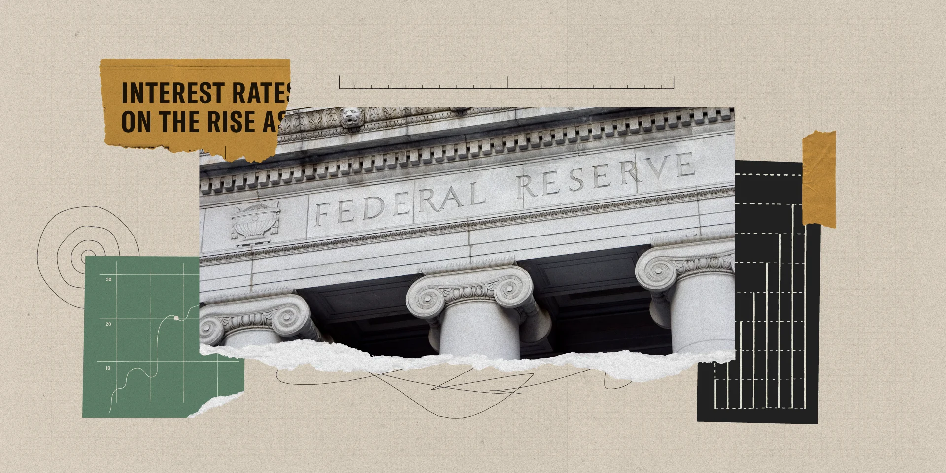
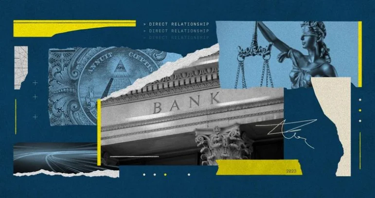
A lot of fintech, finance and corportate money graphics are stagnant, unrefined, full of stock photos, bright/garish and unappealing. I wanted to steer clear of these common traps and focus on work that felt thoughtful, considered and that would stand out in a sea of bright blue and neon green.
The above image is one of my all time favorites.
TREASURY PRIME BLOG
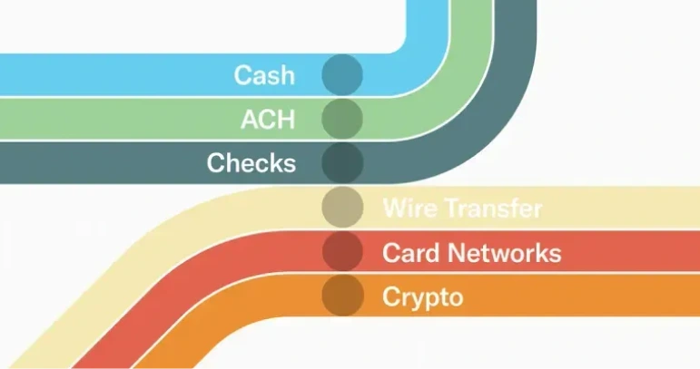
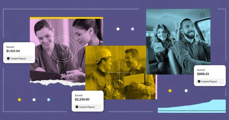
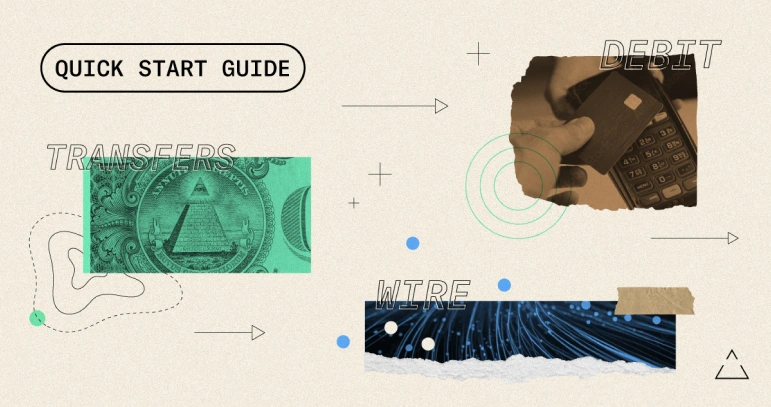
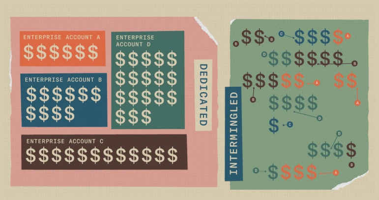
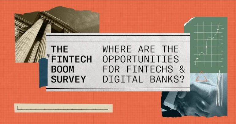
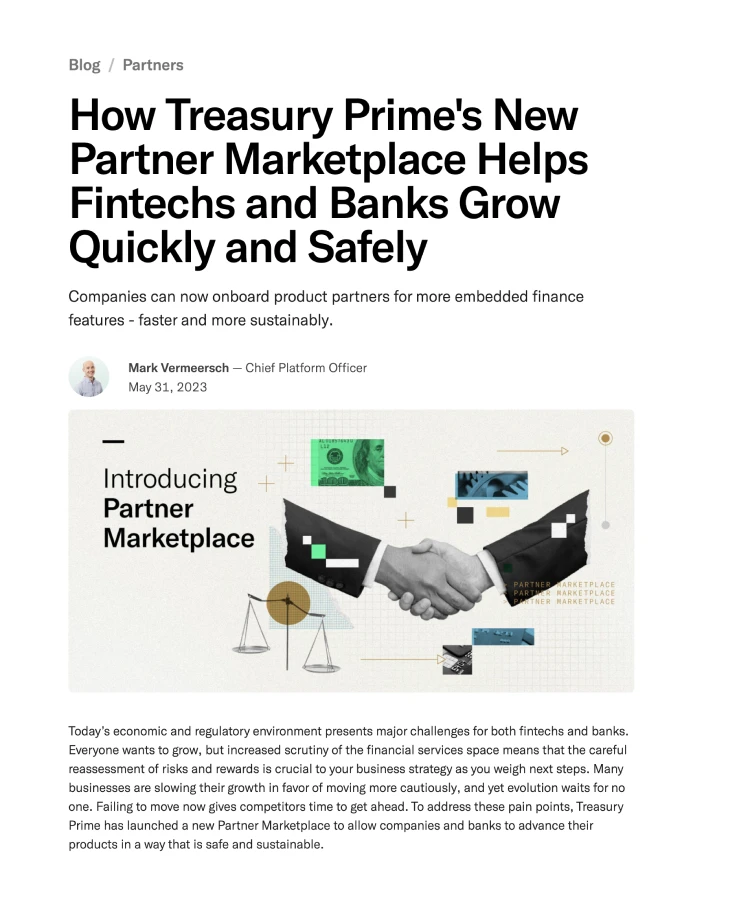
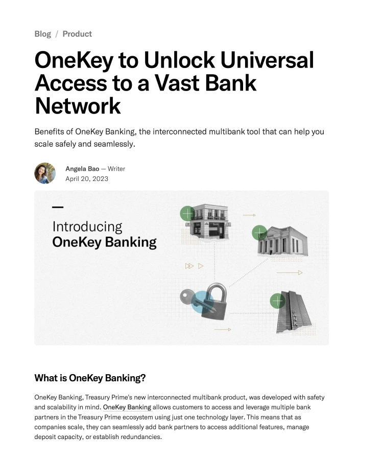
Various graphics for the Treasury Prime blog — a go-to resource within the industry for guides, how-tos, interviews, and best practices.
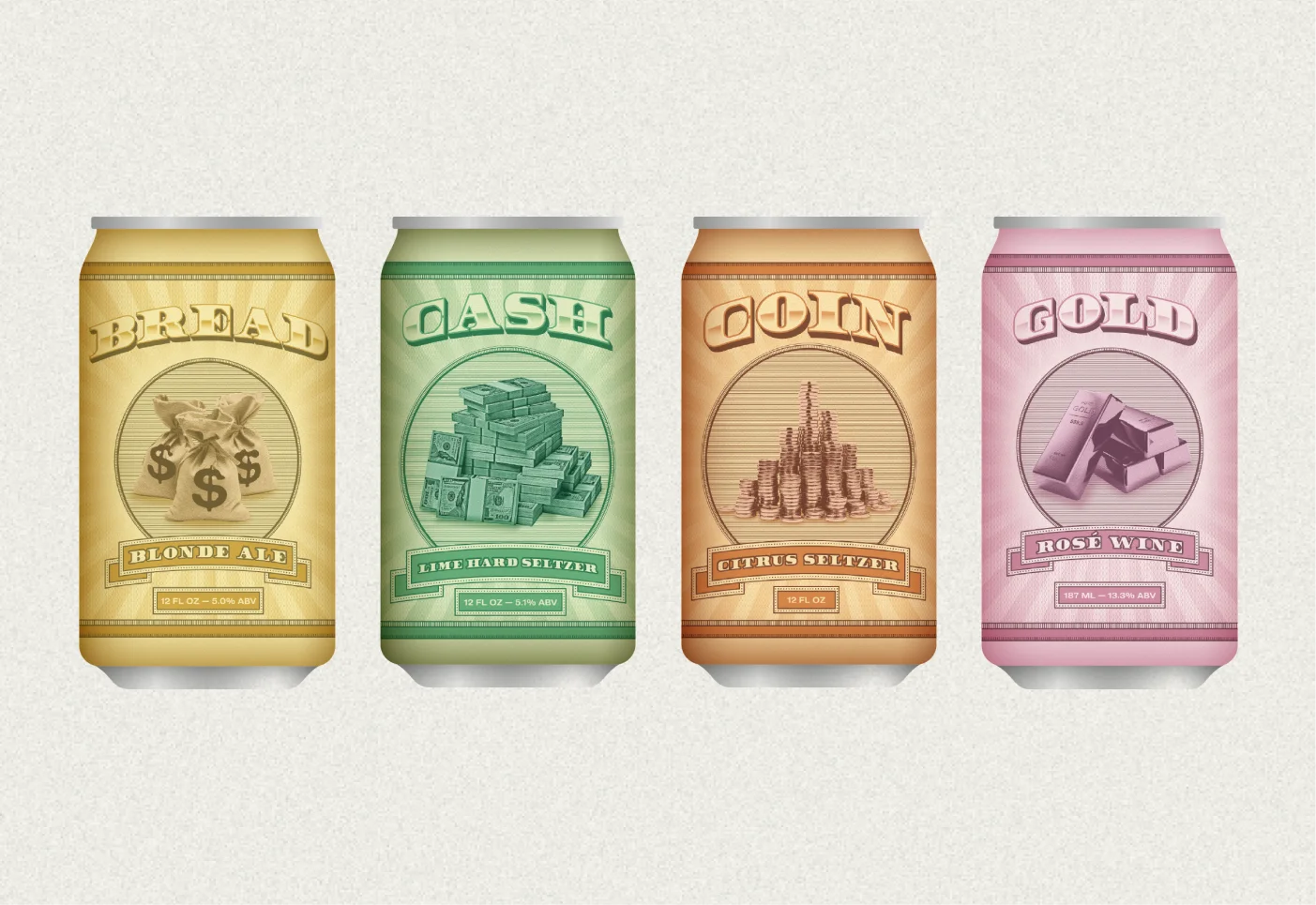
I also wanted to move away from the idea of money being an "intangible" asset. I wanted our customers to have the feeling through working with us that the Treasury Prime product was of a high quality and that money was a real and physical thing — not an abstract currency kept in the cloud or a tokenized asset represented by a math equation.
Using a collage aesthetic along with texture, noise, paper, gradients and photography we elevated our existing visual brand and reinforced Treasury Prime's unique position in the marketplace. This visual style helpd communicate various complicated ideas in an accessible and interesting way (regulatory compliance, on-core banking, ledger reconciliation).


EVENT DESIGN
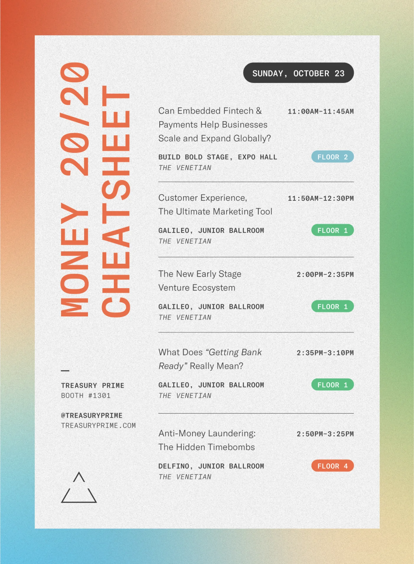
A collection of promo materials and swag for Money2020, the major in-person fintech event of the year. This event was a big deal for our team. We typically had a decent budget and the ability to take time to produce nice materials and experience.
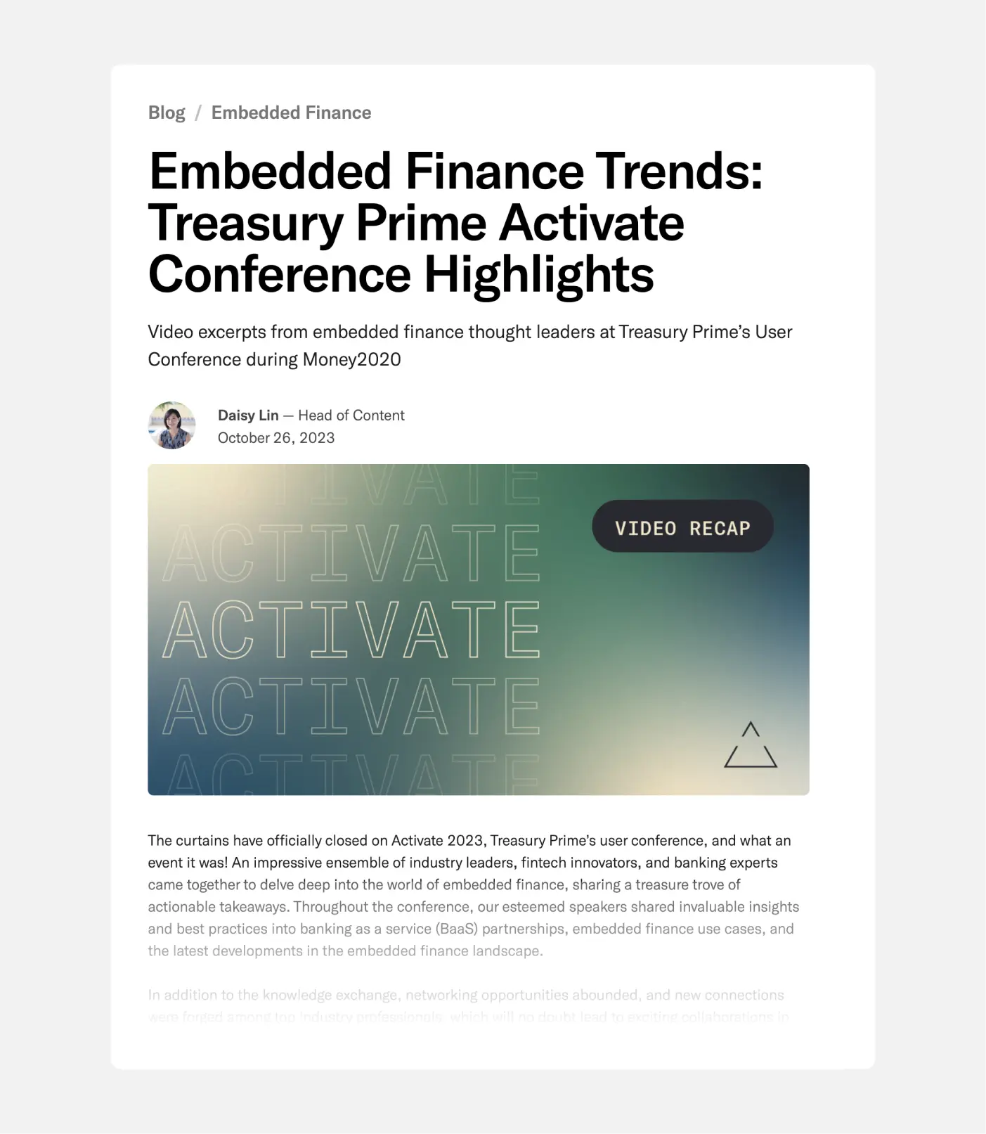
Activate was Treasury Prime's conference-within-a-conference event held in Las Vegas at Money2020. This TPrime sub-brand had a lot of personality. Fuzzed out grainy gradients and chopped up type — this kind of design really doesn't exist in fintech.
COLOR PALETTE
Our color palette went through a few itirations over the years. What started as a more stark black, gray and white palette eventually morphed and found its voice as a subdued but rich scheme.
EBOOKS
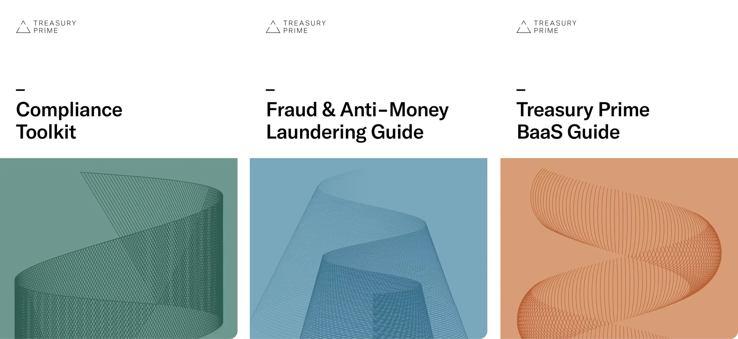
A collection of covers for various guides and ebooks. I really love the simple use of spirographic texture and color.
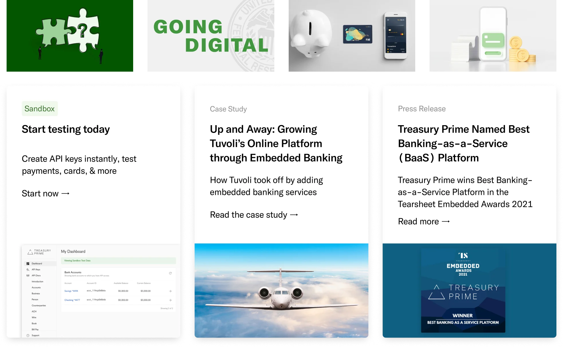
A collection of some graphics and styles prior to my arrival and early on in my time at Treasury Prime. As a team we wanted to retain the legibility and clean typographic hierarchy while pushing the overall brand and visual style.
